Brand Color Contrast Checker
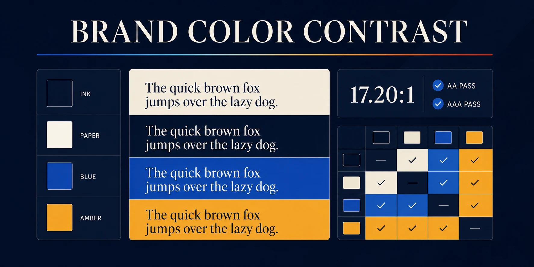
Check brand colors for contrast before the site gets built
A palette looks great on a designer's monitor in a dark office. It looks very different on a phone, in a truck, in a parking lot off the Katy Freeway at two in the afternoon.
The Brand Color Contrast Checker tests your palette against the WCAG contrast formula and shows which pairs hold up. Two to six colors, no signup.
Who needs a contrast check
- Houston businesses picking brand colors for a new Webflow site
- Designers handing a palette to a developer who will use it in ways nobody planned
- Clinics, firms, and public-facing organizations with accessibility obligations
- Anyone whose light gray text on white looked fine until a customer complained
How to use the Brand Color Contrast Checker
- Add two to six brand colors using the pickers or hex values, and name each one.
- Choose a text color and a background color to see a live preview and a detailed pass or fail.
- Review the full matrix, which tests every combination in the palette against each other.
- Read the strongest combinations and the rescue color the tool suggests when a pair fails AA.
- Copy the CSS custom properties or the audit summary, then print the results for handoff.
What the thresholds mean
- 4.5 to 1 is the AA minimum for normal body text
- 3 to 1 covers large text and non-text elements like icons, borders, and form outlines
- 7 to 1 is AAA, worth targeting for long reading and for audiences over sixty
What you get back
- WCAG 2.2 AA and AAA results for normal and large text
- A 3 to 1 non-text contrast check
- A complete palette matrix showing coverage across every pairing
- Ranked accessible combinations and a minimally adjusted rescue color
- Copyable CSS variables for the build
Why this is a business issue, not a design preference
Contrast failures cost conversions quietly. Button labels that fade, form errors nobody sees, phone numbers that disappear in bright light. Most Houston traffic is mobile and much of it is outdoors. A palette that only works indoors is a palette that only works in the studio.
Accessibility also carries legal exposure for public-facing businesses. Contrast is the cheapest part of that problem to fix, and the easiest to fix before launch rather than after.
What this tool does not do
- It checks color contrast only. Keyboard navigation, focus states, alt text, headings, and screen reader behavior all still need testing.
- It does not test your live site. It tests the colors you enter.
- It does not evaluate whether the palette suits your brand. That is a judgment call.
Where to go next
Sort out what the page says before you color it, using the Homepage Section Planner. Sizing the whole build? Run the Website Project Scope Planner.
For a site built with accessible color, type, and structure from the start, see our web design work and our Houston web design pages.
Free brand accessibility tool
Keep the color. Make the contrast work.
Test a single color pair or audit an entire brand palette. You will see which combinations meet WCAG 2.2 contrast thresholds, where each pair is safe to use, and the smallest text-color adjustment that can rescue a miss.
Your brand palette
Add the colors you actually use.
Name each color so the audit and exported CSS stay useful. Three-digit and six-digit hex values are supported.
Selected color pair
See exactly where it passes.
Good design should be easy to read, not merely nice to look at.
Palette coverage
How flexible is the system?
Contrast matrix
Every text and background combination.
Pass or fail uses the full calculated ratio. Displayed ratios are rounded to two decimals only after the result is determined.
Ranked combinations
Start with the strongest pairs.
Developer handoff
Take the palette with you.
Copy clean CSS custom properties based on your color names.
Need the whole system to work?
A passing palette is a good start. The website still needs a clear job.
Nimbus can turn the strategy, writing, design, and development into one coherent website instead of a pile of disconnected decisions.
.avif)

Ready to build something better?
Let's talk about your project and how we can help your business grow online.
.avif)