
A visitor should be able to work out what you do, whether it fits their need, and how to take the next step. Every design choice either helps that journey or adds something else to work around.
These ten principles apply to business websites: service companies, professional firms, and teams using their site to explain an offer and start a conversation. Each comes with a practical check you can run on your own pages.
1. Give each page a clear primary purpose
Before choosing a layout, write down who the page is for and what that person needs from it. A homepage may route visitors to different services. A service page helps someone evaluate an offer. A project page provides evidence that you can handle a particular kind of work.
Pages can support more than one action, but the priority should be visible. If a visitor is comparing providers, burying the service details below a newsletter invitation interrupts the task that brought them there.
Check: describe the page's purpose in one sentence. Then ask whether its headline, content, and main action support that purpose. If a section belongs to another task, consider moving it and adding a useful link.
2. Explain the offer before asking for attention
Your opening should give a new visitor enough information to decide whether to continue. Name the service, the relevant audience or situation, and the area you serve when geography matters.
For example, a hypothetical commercial roofing company could lead with “Roof inspections for Houston property managers.” That tells the reader considerably more than “Elevating excellence.” Add a specific promise only if the business can substantiate it.
A headline does not have to include every detail. Use the supporting copy to explain an important distinction or what happens next. The first screen should begin answering the visitor's question; the rest of the page can supply the detail.
Check: show the page to someone unfamiliar with the business and ask what it offers. Listen to their answer without coaching them.
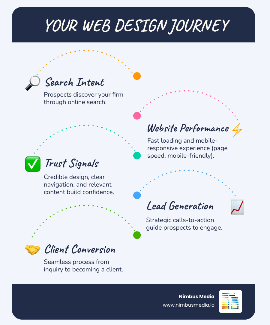
3. Make the reading order visible
Headings, spacing, type size, and contrast help people understand how a page is organized. Give related ideas a visible relationship and give different sections enough separation to be recognizable.
A useful hierarchy lets someone scan the headings and predict where to find an answer. Generic headings such as “The Difference” require the reader to inspect the text beneath them. “What your inspection includes” does more work.
Avoid making every element compete for attention. When every sentence is bold and every card has a different accent color, the page gives the reader fewer clues about what matters.
Check: read only the headings and button labels. They should still describe a coherent journey. Then zoom in and check that the text remains readable without overlapping or disappearing.
4. Use navigation labels people can predict
Navigation should help visitors find familiar things: services, work, pricing, company information, and contact details. The right number of menu items depends on the content, rather than a universal rule.
Organize a broad service list around distinctions customers understand. Internal department names may mean little to a new buyer. If you serve several audiences, explain those routes instead of asking visitors to guess which category includes them.
Check: ask someone to find a particular service and your contact information on a phone. Watch where they hesitate. Test the mobile menu with a keyboard too, including how it opens and closes.
5. Let real content shape the layout
A service with eligibility requirements needs space to explain them. A complicated process may need a sequence. A buyer comparing packages needs to see the differences. Those needs should influence the design before the page is full of decorative boxes.
Use representative copy during design, including a long heading and a detailed project example. This reveals whether the layout can handle real material. A page that only works with placeholder text is still unfinished.
Keep useful qualifications. Removing who a service is for, what a price includes, or how a result was measured can make a sentence shorter and less trustworthy.
Check: highlight every claim that could appear unchanged on a competitor's site. Replace it with a service detail, a relevant example, or evidence you can support. Nimbus's content marketing service addresses the planning and writing behind useful pages.
6. Match evidence to the question it answers
Proof is most useful when the reader can see what it establishes. A project description can demonstrate relevant experience. A customer quotation can explain the working relationship. A credential can confirm a specific qualification.
Use material you have permission to publish and describe it accurately. A logo alone does not explain what you did. A percentage change needs the starting point, period, and context. An illustrative scenario should not read like a real client result.
Check: place the claim and its evidence side by side. Does the evidence actually support the claim? If it supports something narrower, change the wording.
7. Design the complete mobile journey
A responsive layout needs to do more than fit inside a narrow screen. Visitors must be able to open the menu, read service details, compare information, and complete the next step without controls getting in their way.
Check sticky bars, chat widgets, and cookie notices together. Each may look acceptable in isolation while the combined result covers the form. Review image crops so meaningful details survive on smaller screens.
Check: follow a real task on your phone. Read a service page, open a project, and complete a test inquiry. Confirm that the message arrives with the details your team needs.

8. Include performance in design decisions
Images, video, fonts, and third-party scripts all deserve a reason to be on the page. Ask what each adds and whether it delays something the visitor needs.
Google's Core Web Vitals cover loading, responsiveness, and visual stability. The “good” targets are LCP at or below 2.5 seconds, INP at or below 200 milliseconds, and CLS at or below 0.1, evaluated at the 75th percentile of visits. Lab tests help diagnose problems; real-user data measures the experience people actually have.
Check: review a representative service page as well as the homepage. A good homepage score does not establish that a long article, embedded booking tool, or image-heavy project page works well.
9. Make forms and controls understandable
People need to know what a control does, what information is required, and how to recover from an error. Visible labels help visitors keep track of a field after they start typing. W3C's form guidance explains how labels should also be associated with their controls in the code.
Use descriptive links, sufficient contrast, meaningful image alternatives where needed, and keyboard access. Have a qualified reviewer evaluate the relevant accessibility requirements; a plugin or a single automated score cannot stand in for the entire review.
Check: navigate the contact journey without a mouse. Confirm that focus is visible, instructions remain available, and an error explains how to correct the input.
10. Connect related pages with useful links
Internal links should follow the reader's next question. A guide explaining redesign costs can point to the design service. A project in a particular area can lead to relevant local information. Link text should describe the destination so readers can decide whether to follow it.
Build separate service or area pages when there is enough useful information to justify them. A long list of near-identical pages is not a substitute for explaining what you offer and where it is available.
For businesses planning local pages, Nimbus provides local SEO services. Owners looking for design help can also review our Sugar Land web design and Cypress web design pages.
Check: pick an important guide or service page. Can a reader reach the most relevant next page from the body, without returning to the main menu?
Turn the review into a short work list
Record each problem, the page affected, and the customer task it interrupts. Fix broken journeys first, then work through unclear offers, missing proof, and presentation issues. Give each change an owner and a way to check completion.
When several problems share the same structure or content model, discuss whether a broader redesign would be more practical. Our web design service brings the copy, layout, and build into that conversation. Start with the task your customers need to complete.
.svg)
.avif)
FAQs
Common questions about our web design and SEO services in Houston.
What are the most important web design basics?
Make the offer understandable, organize pages around real customer tasks, use clear navigation, provide relevant evidence, and make the complete journey usable across devices. Performance, accessibility, and maintenance belong in the design brief too.
How many pages does a small business website need?
Enough to explain its distinct services, establish credibility, and support the next step. Add a separate page when it has a useful purpose and sufficient content. There is no page count that guarantees a good website.
Can a template work for a business website?
Yes, if it supports your content, editing needs, accessibility requirements, and customer journey. Evaluate the actual result and the cost of adapting it. A custom design still needs clear writing and careful implementation.
Does a fast website guarantee more inquiries?
No. Speed removes one potential source of friction, but inquiries also depend on the audience, offer, evidence, and contact process. Assess performance alongside the complete journey and the quality of the leads received.
What should I check first on my website?
Try a real customer task on a phone: find the appropriate service, read what is included, and send a test inquiry. Confirm delivery. Then ask someone unfamiliar with the business to explain the offer and watch where they hesitate.
Still have questions?
We're happy to answer any additional questions you might have.
.avif)
.avif)
More from our blog
Explore more insights on web design, SEO, and digital marketing.



.avif)

Ready to build something better?
Let's talk about your project and how we can help your business grow online.
.avif)